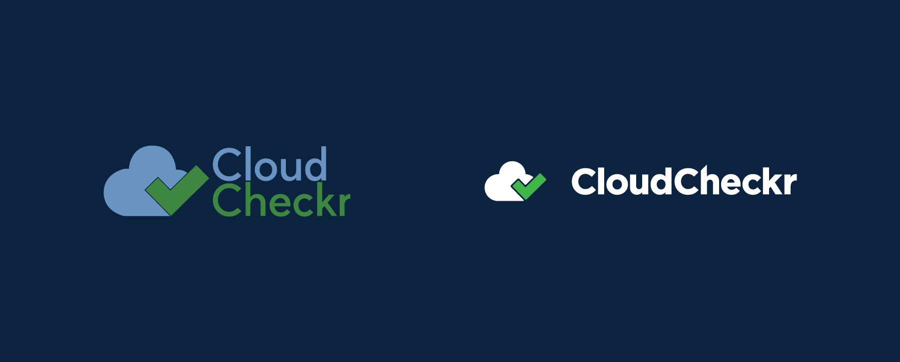
2017 Logo (Left side) & 2018 Logo (Right Right)

2019 Vertically Stacked Logo - I designed a refreshed logo, something that was not so literal but still captures the spirit of our previous icon by merging it with the letter "C" from our wordmark, resulting in an abstract cloud that also begins with the letter "C." This logo is intended to resemble a clock, highlighting our commitment to helping users save both time and money while utilizing our platform. The tapering ends of the checkmark is intended to represent speed and the hands of the clock.

2019 Vertically Stacked Logo in Inverse/White & Mono Background - Always utilize the color version of our logo against a white or light gray background. However, an exception allows for the use of the inverse/white version on solid colors or image backgrounds, provided there is adequate contrast.

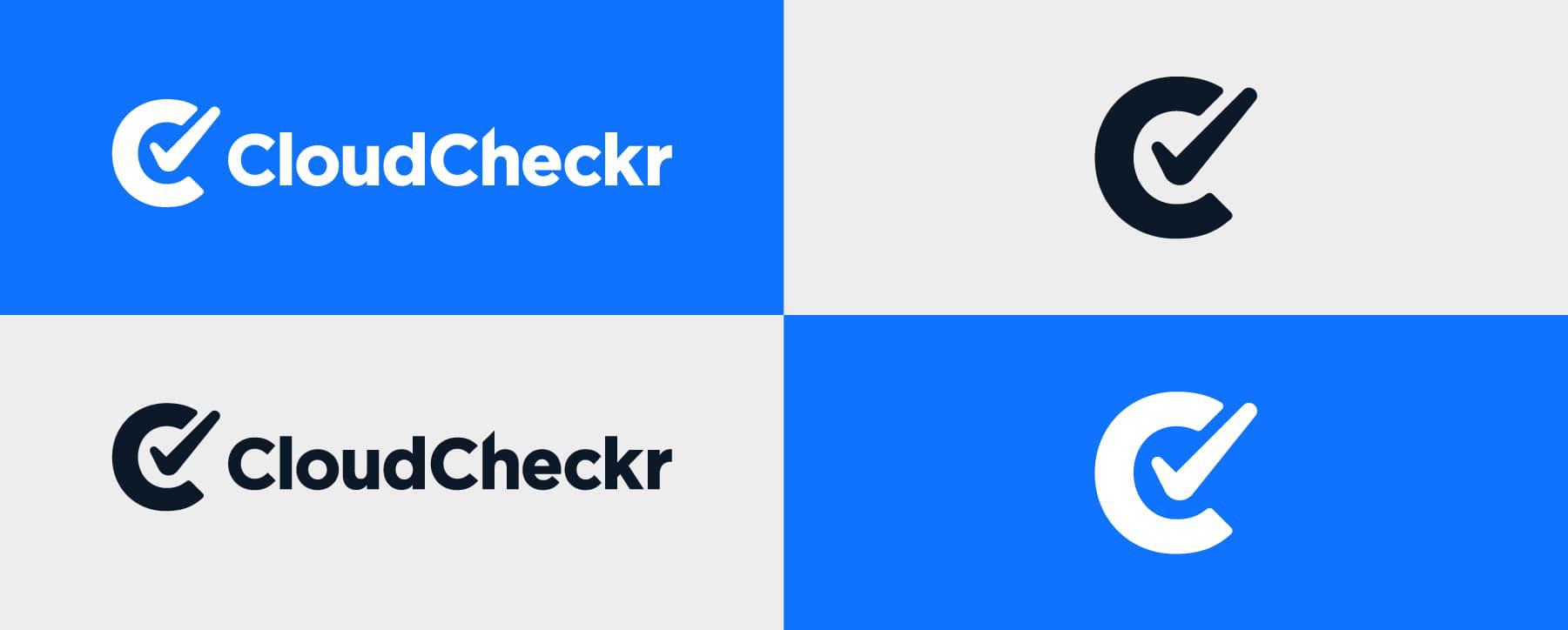
Horizontal Logo & Icons

2019 Horizontal Logo & Icon in Inverse/White & Mono Background - Always utilize the color version of our logo against a white or light gray background. However, an exception allows for the use of the inverse/white version on solid colors or image backgrounds, provided there is adequate contrast.

Wordmark - Our logo consists of a stylized typeface. The horizontal layout is used in all visual placements of the logo across the brand.

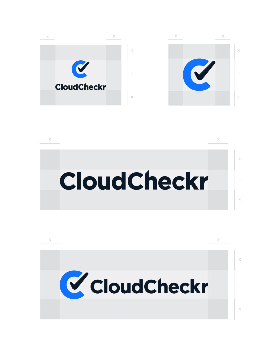
Logo Identity Clearance - The use of clear space around our icon ensures visibility at all times.

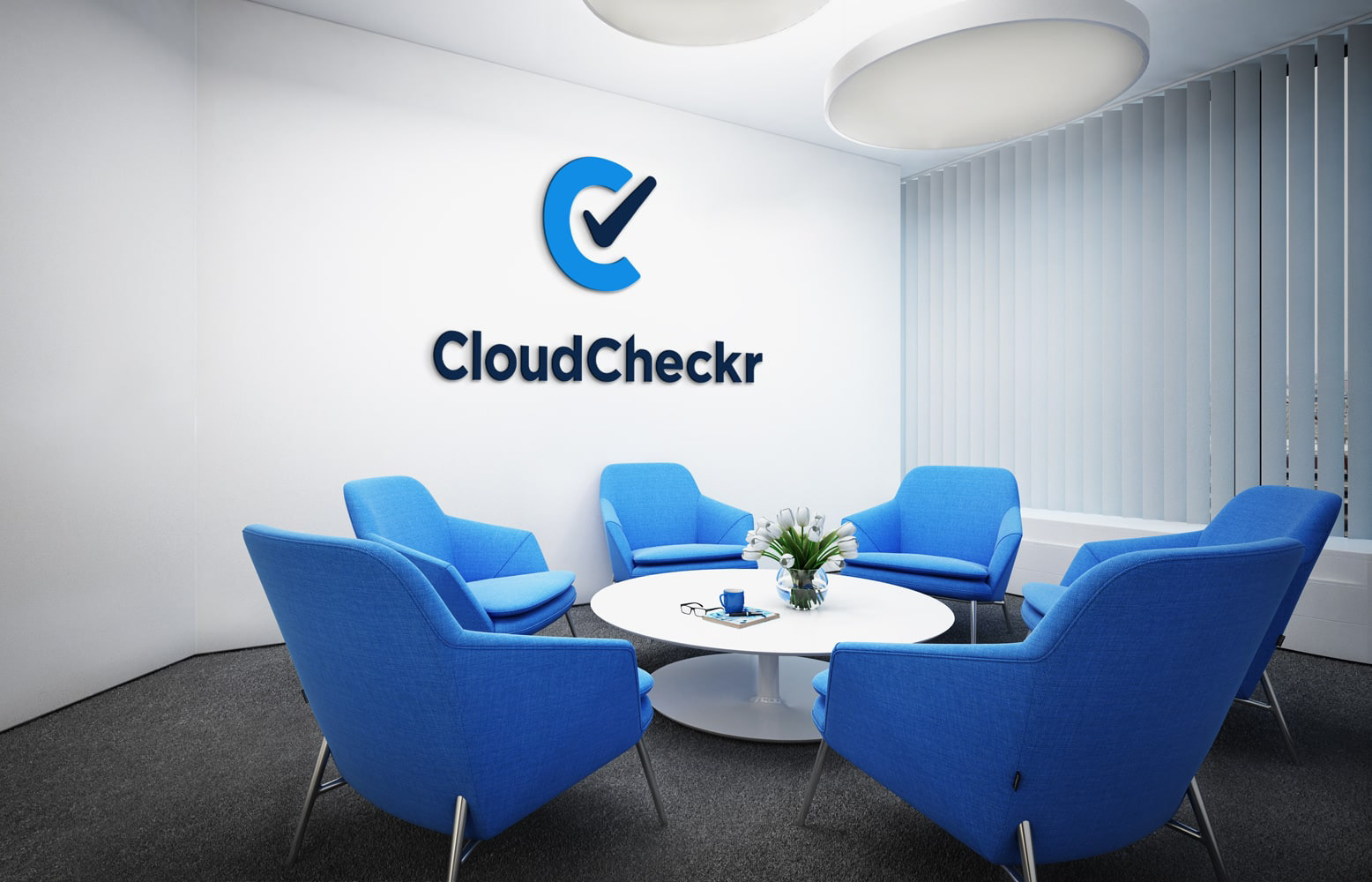
Vertical Stack Logo Office Application

Vertical Stack Logo Office Window Application

Horizontal Logo & Icon T-shirt Mockup

Horizontal Logo Office Window Application

Icon Office Window Application

Icon Avatar Social Media Application

Color Palette

Typography

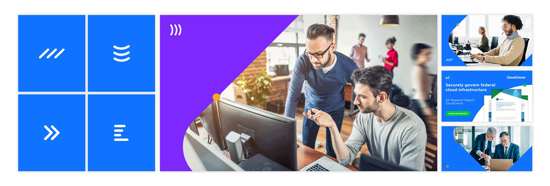
Environmental Photography - iStockphoto.com serves as our main resource for photography. We prioritize authentic images without filters, featuring people and vibrant colors that ideally align with CloudCheckr’s color palette.

45° Angles - When creating any collateral, it is essential to maintain a consistent structure by using 45° angles across the brand when possible.

Icons

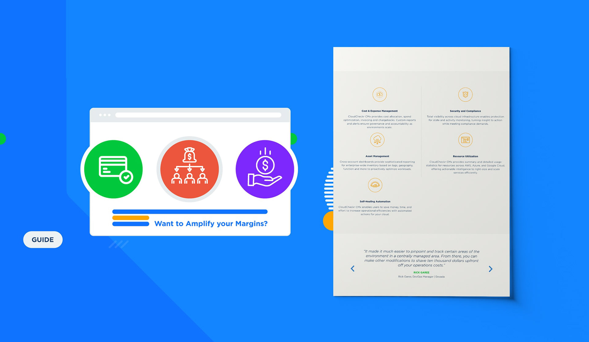
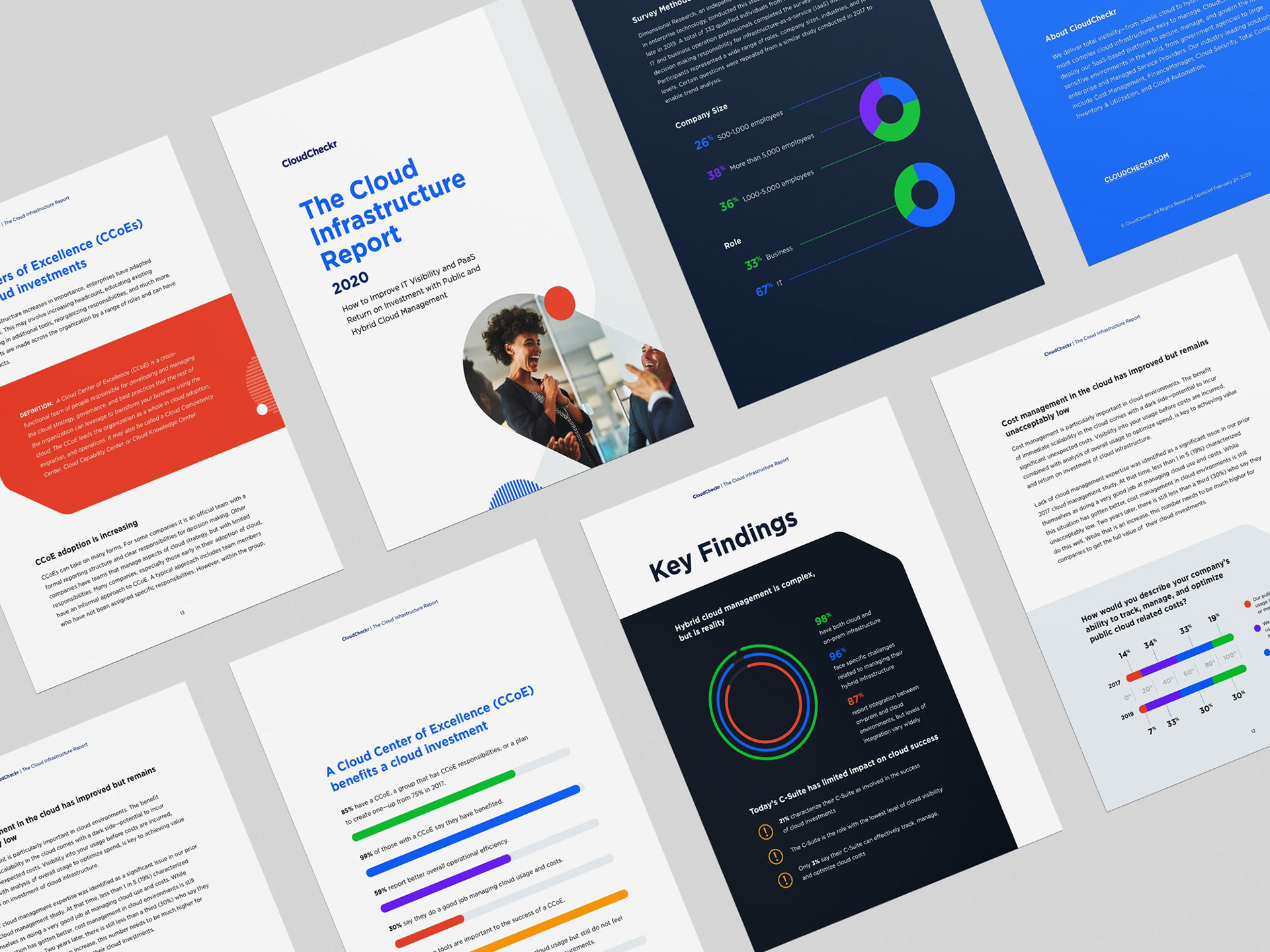
Collateral - Public-facing collateral should always follow our brand identity. Internal and partner-facing material may receive simplified styling.

Symbols - The dash symbols are a flexible and dynamic visual elements that are used to visually connect sections of content. These should be used sparingly and only one symbol per application.

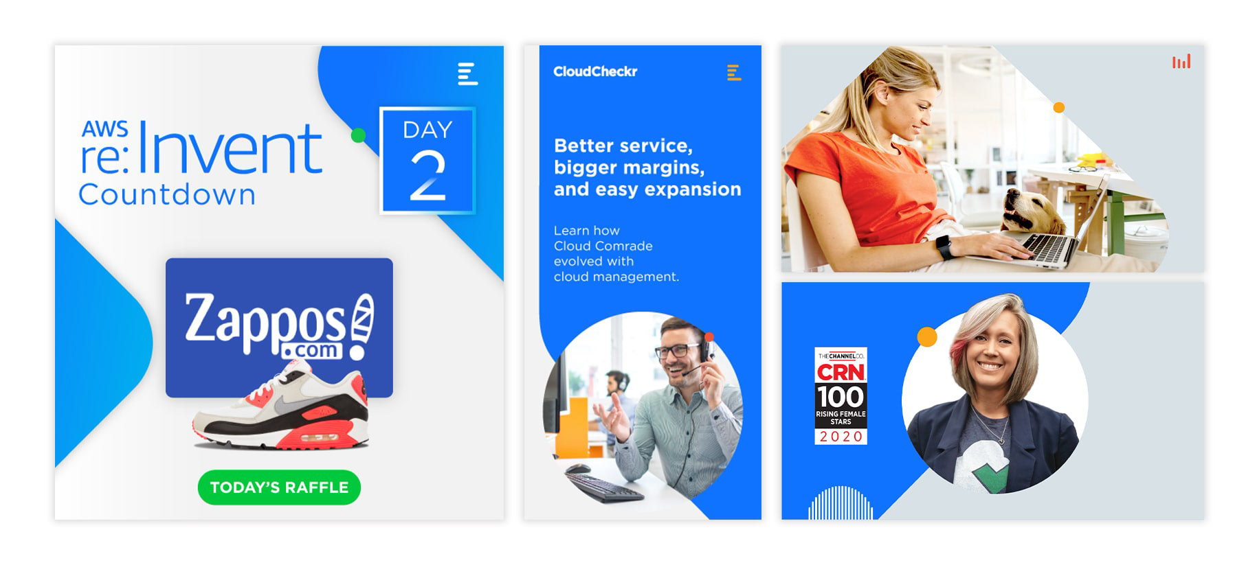
Social Media Post

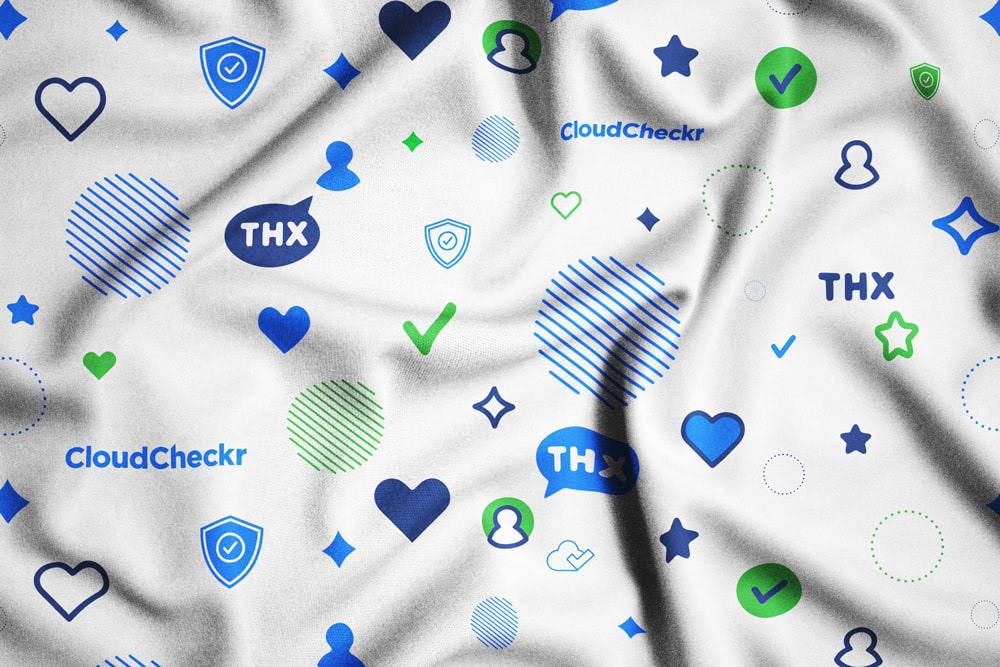
Brand Pattern - This repeating pattern serves as a visual enhancement that reinforces the brand identity across various materials. It features a combination of icons, symbols, and our wordmark, harmonized with our color palette to unify the overall aesthetic of the brand.

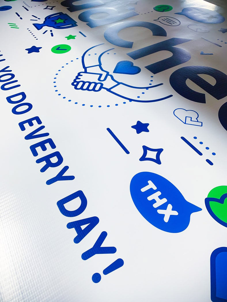
Vinyl Wrap Employee Appreciation Banner

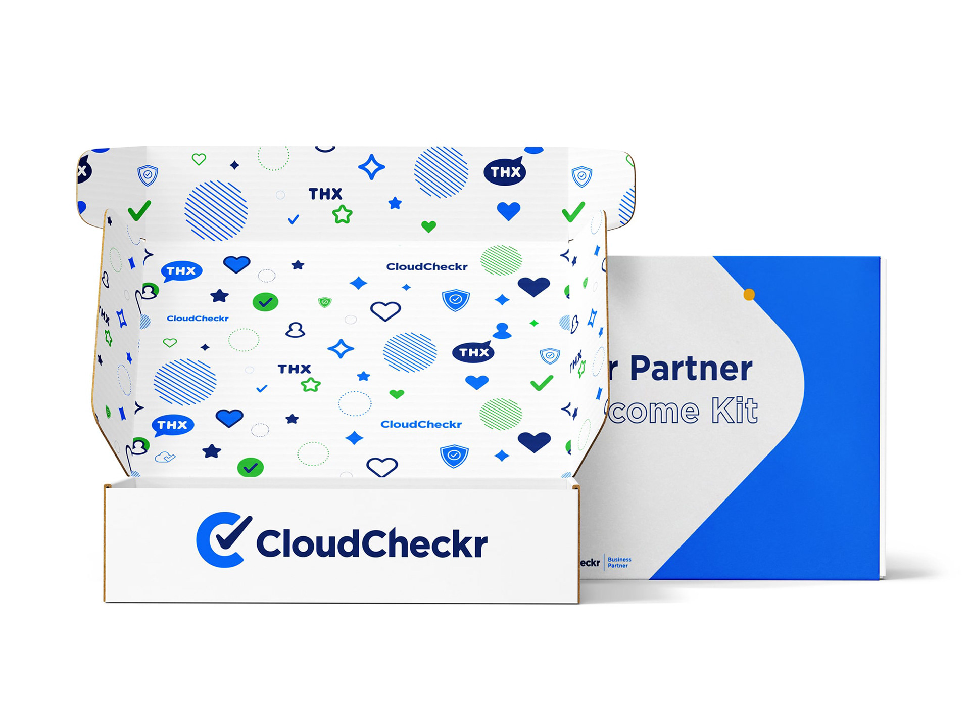
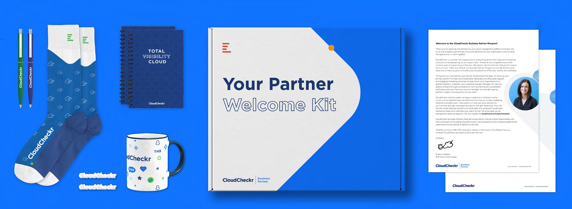
Packaging for Partner Welcoming Kit

Partner Welcoming Kit - This package features a welcoming letter from the Senior Vice President of Growth and Strategy, along with a pattern-branded coffee mug, enamel pins, a pocket notebook, throwback socks, and pens.

Google Display Ads

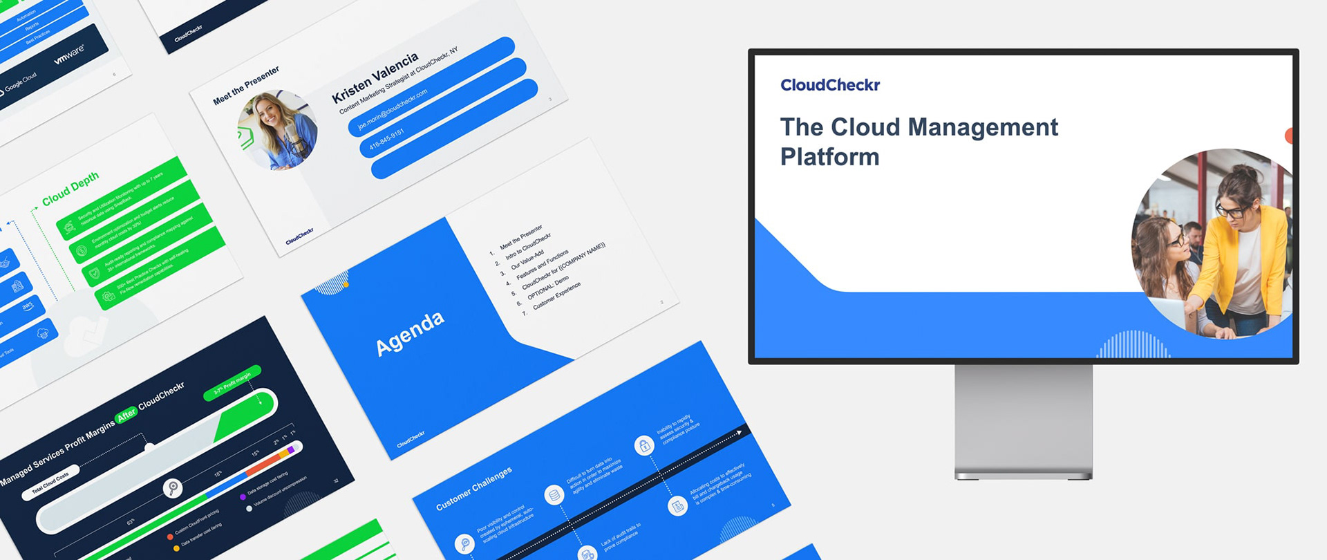
Presentation Slide Deck

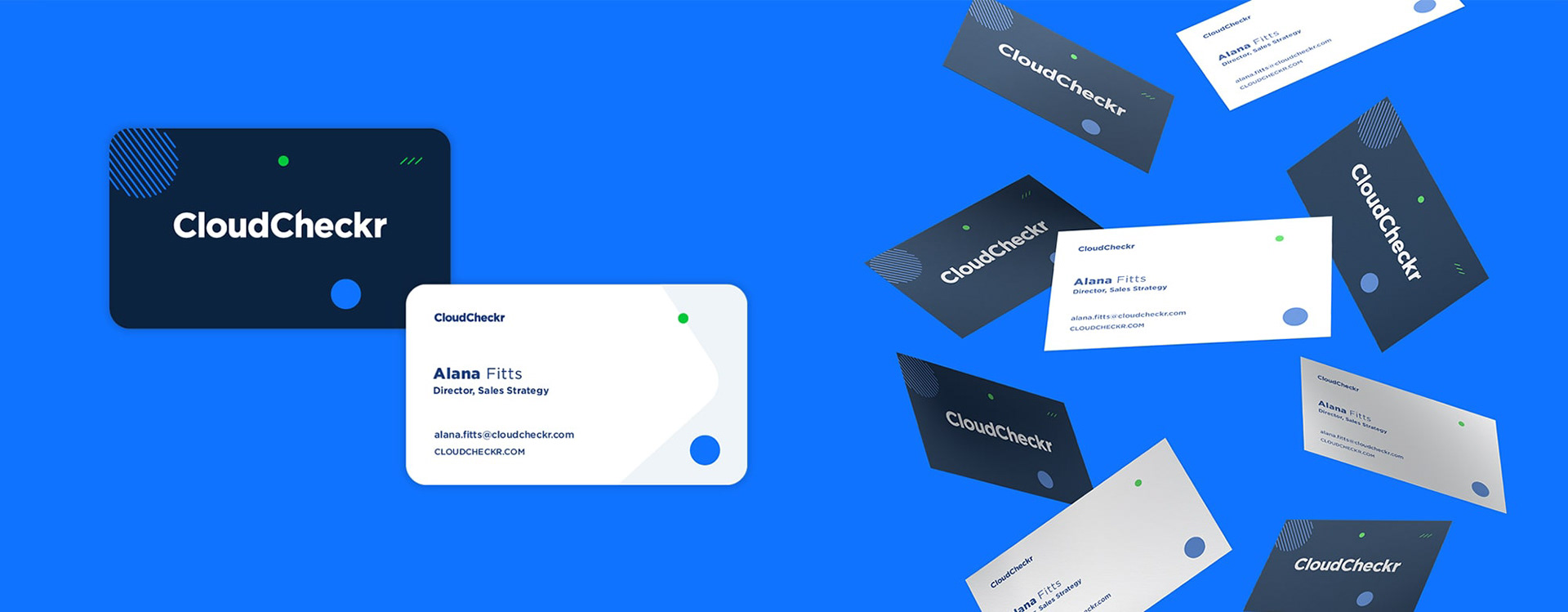
Horizontal Business Cards

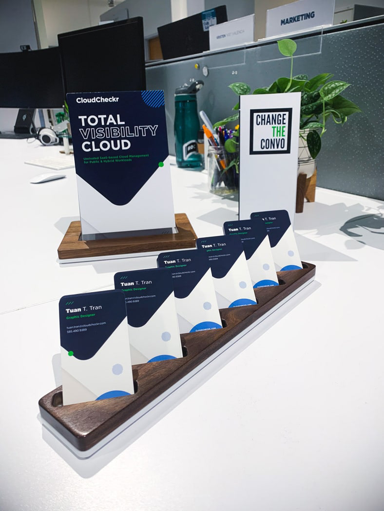
Vertical Business Cards

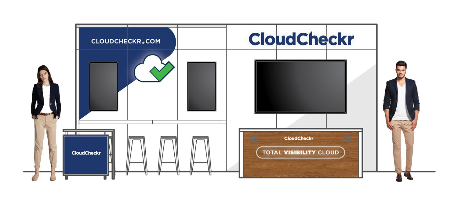
AWS re:Invent Trade Show Booth, Las Vegas 2019

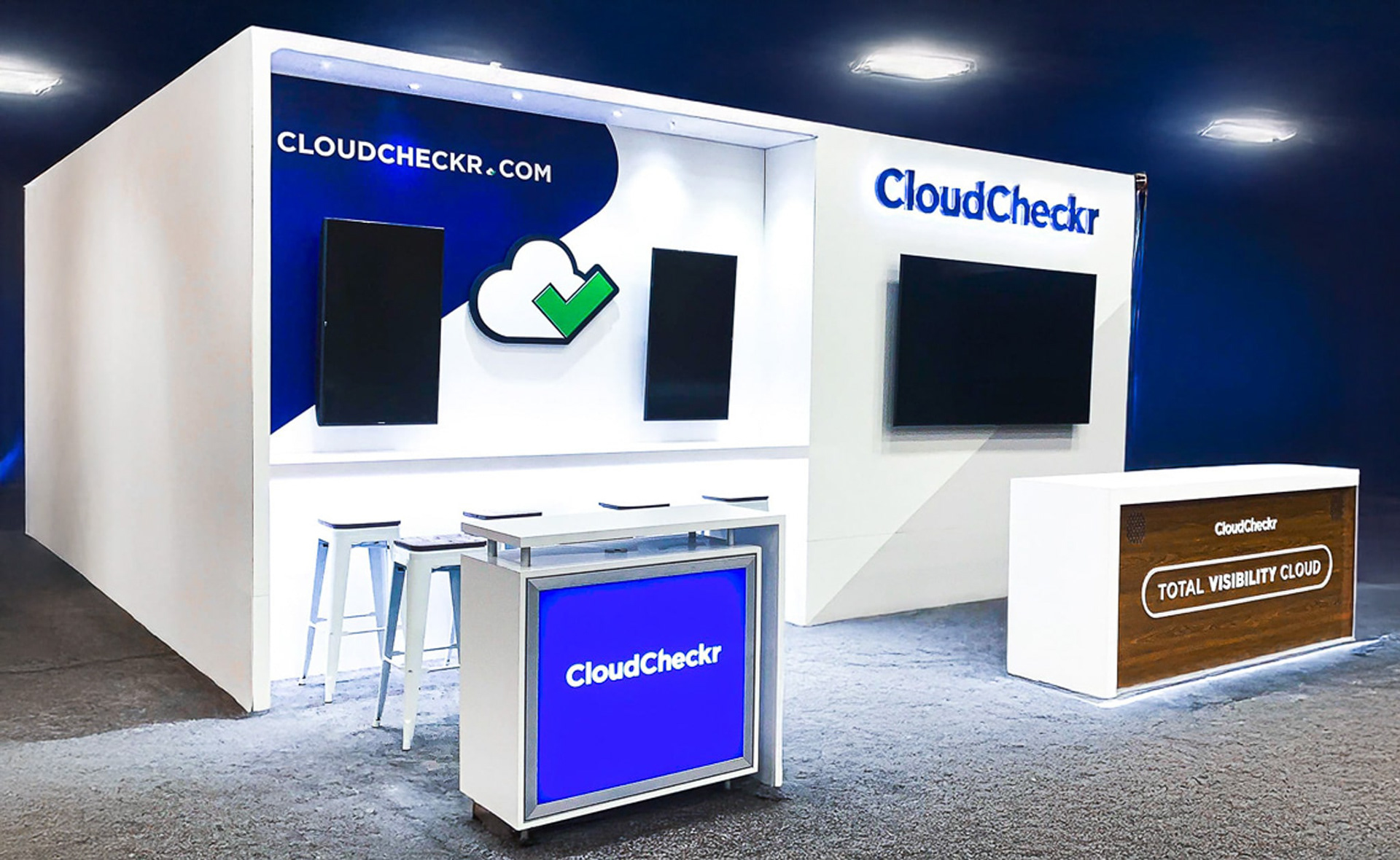
AWS re:Invent Trade Show Booth Photo, Las Vegas 2019

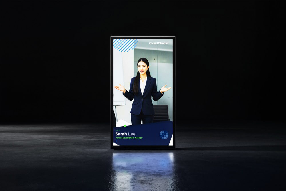
re:Invent Trade Show Placeholder
